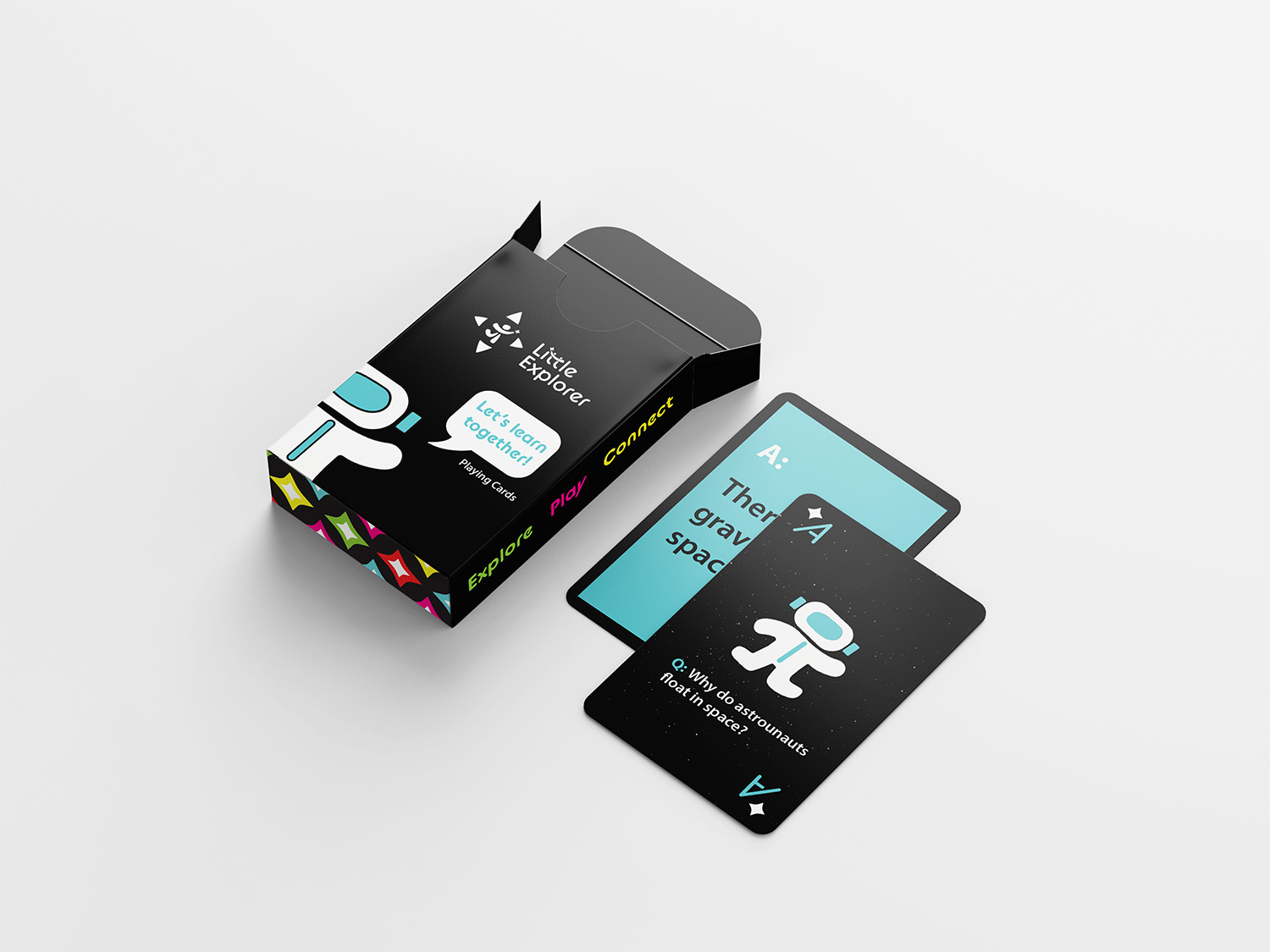
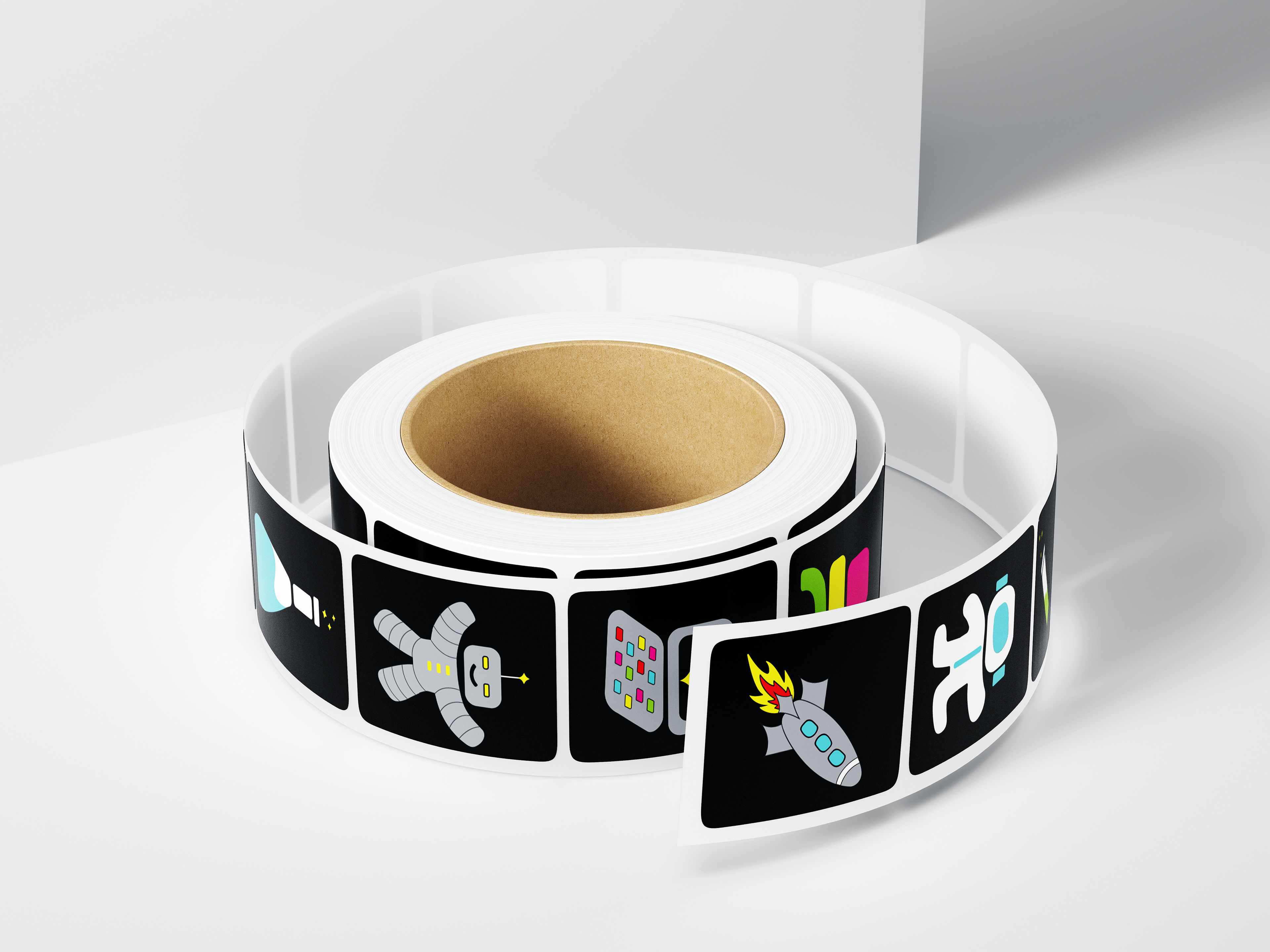
Little Explorer Discovery Center focuses on play in a world of science, technology, and space. It is a hands-on center with exhibits and classes that encourage kids through experiential learning. It offers unique experiences including virtual reality, a planetarium, and many exhibits made for kids to connect and learn about science and technology.
This brand identity includes a word mark and logo design, brand standards manual, illustrations and assets.
Brand Standards Guide
Business Cards and Social
The logo for Little Explorer was designed to integrate the concepts of touch/play, science, and technology. The image of a child reaching for a star symbolizes the center’s hands-on approach to learning and exploration. The use of the pi symbol, along with the shooting star, inspired the design of the child’s arms and legs. Additionally, the arrows in the logo represent the directional pad found on a gaming controller, further emphasizing the center’s focus on interactive and dynamic learning experiences in STEM.
Children's Apparel and Backpacks


Digital Interactive Game and Indoor Signage
Messaging for kids at Little Explorer includes open ended questions on signage, so they can be included. For billboard, social media and other advertisements, Little Explorer focuses the communication on parents. This allows them to see the possibilities that Little Explorer has to offer for their child’s future in STEM.
Billboard Advertisement


